Websites designed for
your business.
We create modern website designs that clearly communicate your brand, make it easy for customers to find what they need, and guide them toward taking action.
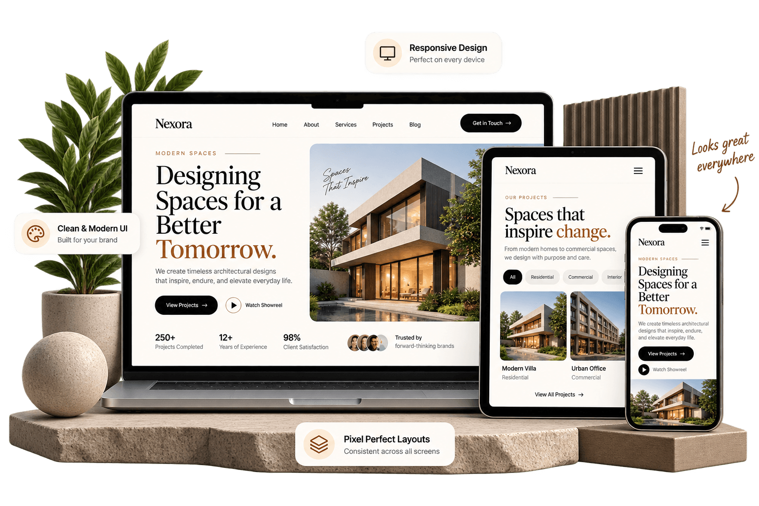
Websites designed for
your business.
We create modern website designs that clearly communicate your brand, make it easy for customers to find what they need, and guide them toward taking action.
Good website design does more than look beautiful.
A well-designed website helps people understand your business, find what they need, trust your brand, and take the next step.
STRATEGIC IMPACT
Great design makes your message clearer, your business easier to understand, and it easier for visitors to become customers.
Builds Trust
Clean, professional design helps visitors feel confident in your business from the moment they arrive.
Makes Your Message Clear
A clear visual structure helps visitors quickly understand what you offer, who you serve, and why it matters.
Easy to Navigate
Simple navigation and thoughtful layouts help visitors find information without getting frustrated.
Works on Every Device
Your website should provide a smooth, consistent experience across phones, tablets, laptops, and desktops.
Guides Visitors to Act
Clear calls to action and well-structured pages help visitors know what to do next.
Looks Like Your Brand
A custom visual style makes your business feel distinctive instead of looking like another template-based website.
Good website design does more than look beautiful.
A well-designed website helps people understand your business, find what they need, trust your brand, and take the next step.
STRATEGIC IMPACT
Great design makes your message clearer, your business easier to understand, and it easier for visitors to become customers.
Builds Trust
Clean, professional design helps visitors feel confident in your business from the moment they arrive.
Makes Your Message Clear
A clear visual structure helps visitors quickly understand what you offer, who you serve, and why it matters.
Easy to Navigate
Simple navigation and thoughtful layouts help visitors find information without getting frustrated.
Works on Every Device
Your website should provide a smooth, consistent experience across phones, tablets, laptops, and desktops.
Guides Visitors to Act
Clear calls to action and well-structured pages help visitors know what to do next.
Looks Like Your Brand
A custom visual style makes your business feel distinctive instead of looking like another template-based website.
Website design services for your business.
We design websites that are clear, professional, easy to use, and built around your brand, customers, and business goals.
Visual Website Design
Creating clean, professional page designs that match your brand and make your business look its best.
User Experience Design
Planning simple, intuitive layouts that help visitors find what they need and move through your website easily.
Responsive Web Design
Designing websites that look and work smoothly across phones, tablets, laptops, and desktop screens.
Landing Page Design
Creating focused pages for specific products, services, campaigns, or marketing goals.
Website Redesign
Updating outdated websites with a cleaner design, better structure, and a more modern experience.
Consistent Website Design
Creating reusable visual styles for buttons, forms, layouts, typography, and other website elements.
Clear Calls to Action
Structuring pages and content so visitors clearly understand what to do next.
Interactive Website Design
Adding thoughtful animations and interactions that make the website feel polished without getting in the way.
Website design services for your business.
We design websites that are clear, professional, easy to use, and built around your brand, customers, and business goals.
Visual Website Design
Creating clean, professional page designs that match your brand and make your business look its best.
User Experience Design
Planning simple, intuitive layouts that help visitors find what they need and move through your website easily.
Responsive Web Design
Designing websites that look and work smoothly across phones, tablets, laptops, and desktop screens.
Landing Page Design
Creating focused pages for specific products, services, campaigns, or marketing goals.
Website Redesign
Updating outdated websites with a cleaner design, better structure, and a more modern experience.
Consistent Website Design
Creating reusable visual styles for buttons, forms, layouts, typography, and other website elements.
Clear Calls to Action
Structuring pages and content so visitors clearly understand what to do next.
Interactive Website Design
Adding thoughtful animations and interactions that make the website feel polished without getting in the way.
Responsive design across desktop, tablet, and mobile.
Over 60% of modern web traffic originates from handheld screens. We design fluid, adaptive layouts where typography scales smoothly, touch targets expand, and navigation remains effortless.
Fluid Layout Grids
Multi-column proportional layouts that seamlessly reflow from 12-column desktop frames to single-column phone viewports without horizontal scroll bugs.
Thumb-Friendly Touch Targets
Interactive elements, selectors, and CTA buttons maintain a minimum 44×44px touch footprint with comfortable padding to prevent accidental taps on mobile touchscreens.
Fluid Typography Scaling
Using mathematical CSS clamp() scales, headlines and body copy scale dynamically with screen width, ensuring optimal readability without jarring breakpoint jumps.
Adaptive Navigation Patterns
Desktop top-bar navigation cleanly shifts into an accessible slide-out mobile drawer or bottom app-style bar with effortless thumb reach.
Responsive Art Direction
Hero photography and diagrams crop and reposition across breakpoints so the focal point of the visual remains prominent on narrow vertical screens.
Proportional Whitespace
Margins, paddings, and line-heights compress gracefully on handheld displays to maximize screen real estate while retaining an editorial, uncrowded feel.
Sub-Second Mobile Speeds
Responsive modern WebP/AVIF images with srcset sizing ensure mobile visitors on cellular connections do not download heavy desktop image files.
Cross-Device QA Testing
Every design is stress-tested on real physical Apple iOS and Android hardware across Chrome, Safari, and Firefox before entering development.
Connecting to https://animalsathi.com/ ...
Fluid Layout Grids
Multi-column proportional layouts that seamlessly reflow from 12-column desktop frames to single-column phone viewports without horizontal scroll bugs.
Thumb-Friendly Touch Targets
Interactive elements, selectors, and CTA buttons maintain a minimum 44×44px touch footprint with comfortable padding to prevent accidental taps on mobile touchscreens.
Fluid Typography Scaling
Using mathematical CSS clamp() scales, headlines and body copy scale dynamically with screen width, ensuring optimal readability without jarring breakpoint jumps.
Adaptive Navigation Patterns
Desktop top-bar navigation cleanly shifts into an accessible slide-out mobile drawer or bottom app-style bar with effortless thumb reach.
Responsive Art Direction
Hero photography and diagrams crop and reposition across breakpoints so the focal point of the visual remains prominent on narrow vertical screens.
Proportional Whitespace
Margins, paddings, and line-heights compress gracefully on handheld displays to maximize screen real estate while retaining an editorial, uncrowded feel.
Sub-Second Mobile Speeds
Responsive modern WebP/AVIF images with srcset sizing ensure mobile visitors on cellular connections do not download heavy desktop image files.
Cross-Device QA Testing
Every design is stress-tested on real physical Apple iOS and Android hardware across Chrome, Safari, and Firefox before entering development.
Responsive design across desktop, tablet, and mobile.
Over 60% of modern web traffic originates from handheld screens. We design fluid, adaptive layouts where typography scales smoothly, touch targets expand, and navigation remains effortless on any device.
Fluid Layout Grids
Multi-column proportional layouts that seamlessly reflow from 12-column desktop frames to single-column phone viewports without horizontal scroll bugs.
Thumb-Friendly Touch Targets
Interactive elements, selectors, and CTA buttons maintain a minimum 44×44px touch footprint with comfortable padding to prevent accidental taps on mobile touchscreens.
Fluid Typography Scaling
Using mathematical CSS clamp() scales, headlines and body copy scale dynamically with screen width, ensuring optimal readability without jarring breakpoint jumps.
Adaptive Navigation Patterns
Desktop top-bar navigation cleanly shifts into an accessible slide-out mobile drawer or bottom app-style bar with effortless thumb reach.
Responsive Art Direction
Hero photography and diagrams crop and reposition across breakpoints so the focal point of the visual remains prominent on narrow vertical screens.
Proportional Whitespace
Margins, paddings, and line-heights compress gracefully on handheld displays to maximize screen real estate while retaining an editorial, uncrowded feel.
Sub-Second Mobile Speeds
Responsive modern WebP/AVIF images with srcset sizing ensure mobile visitors on cellular connections do not download heavy desktop image files.
Cross-Device QA Testing
Every design is stress-tested on real physical Apple iOS and Android hardware across Chrome, Safari, and Firefox before entering development.
Connecting to https://animalsathi.com/ ...
Fluid Layout Grids
Multi-column proportional layouts that seamlessly reflow from 12-column desktop frames to single-column phone viewports without horizontal scroll bugs.
Thumb-Friendly Touch Targets
Interactive elements, selectors, and CTA buttons maintain a minimum 44×44px touch footprint with comfortable padding to prevent accidental taps on mobile touchscreens.
Fluid Typography Scaling
Using mathematical CSS clamp() scales, headlines and body copy scale dynamically with screen width, ensuring optimal readability without jarring breakpoint jumps.
Adaptive Navigation Patterns
Desktop top-bar navigation cleanly shifts into an accessible slide-out mobile drawer or bottom app-style bar with effortless thumb reach.
Responsive Art Direction
Hero photography and diagrams crop and reposition across breakpoints so the focal point of the visual remains prominent on narrow vertical screens.
Proportional Whitespace
Margins, paddings, and line-heights compress gracefully on handheld displays to maximize screen real estate while retaining an editorial, uncrowded feel.
Sub-Second Mobile Speeds
Responsive modern WebP/AVIF images with srcset sizing ensure mobile visitors on cellular connections do not download heavy desktop image files.
Cross-Device QA Testing
Every design is stress-tested on real physical Apple iOS and Android hardware across Chrome, Safari, and Firefox before entering development.
Custom website or template?
Both can work, but the right choice depends on your goals, budget, and how much flexibility your business needs.
Design & Brand
Designed around your brand, style, and business rather than a pre-made layout.
Starts with an existing design that can be customized within the template's options.
Flexibility
Layouts and features can be designed around exactly what your business needs.
Works well within the features and structure provided by the chosen template.
User Experience
The structure and navigation can be planned around your customers and the information they need.
User flows are generally adapted to the existing template structure.
Calls to Action
Page layouts can be structured around your specific goals, such as enquiries, bookings, sales, or sign-ups.
Calls to action are usually placed within the template's existing page structure.
Future Changes
Built with your future needs in mind, making it easier to extend the design as your business evolves.
New requirements may depend on available template features, plugins, and customization options.
Cost & Time
Usually requires more planning and design time, making it a larger initial investment.
Typically offers a faster and lower-cost way to get started.
Best For
Businesses that want a distinctive brand experience and more control over the final website.
Businesses that need a simple website quickly and have straightforward requirements.
| EVALUATION FACTOR | CUSTOM WEBSITE DESIGN | TEMPLATE-BASED WEBSITE |
|---|---|---|
Design & Brand | Designed around your brand, style, and business rather than a pre-made layout. | Starts with an existing design that can be customized within the template's options. |
Flexibility | Layouts and features can be designed around exactly what your business needs. | Works well within the features and structure provided by the chosen template. |
User Experience | The structure and navigation can be planned around your customers and the information they need. | User flows are generally adapted to the existing template structure. |
Calls to Action | Page layouts can be structured around your specific goals, such as enquiries, bookings, sales, or sign-ups. | Calls to action are usually placed within the template's existing page structure. |
Future Changes | Built with your future needs in mind, making it easier to extend the design as your business evolves. | New requirements may depend on available template features, plugins, and customization options. |
Cost & Time | Usually requires more planning and design time, making it a larger initial investment. | Typically offers a faster and lower-cost way to get started. |
Best For | Businesses that want a distinctive brand experience and more control over the final website. | Businesses that need a simple website quickly and have straightforward requirements. |
Custom website or template?
Both can work, but the right choice depends on your goals, budget, and how much flexibility your business needs.
Design & Brand
Designed around your brand, style, and business rather than a pre-made layout.
Starts with an existing design that can be customized within the template's options.
Flexibility
Layouts and features can be designed around exactly what your business needs.
Works well within the features and structure provided by the chosen template.
User Experience
The structure and navigation can be planned around your customers and the information they need.
User flows are generally adapted to the existing template structure.
Calls to Action
Page layouts can be structured around your specific goals, such as enquiries, bookings, sales, or sign-ups.
Calls to action are usually placed within the template's existing page structure.
Future Changes
Built with your future needs in mind, making it easier to extend the design as your business evolves.
New requirements may depend on available template features, plugins, and customization options.
Cost & Time
Usually requires more planning and design time, making it a larger initial investment.
Typically offers a faster and lower-cost way to get started.
Best For
Businesses that want a distinctive brand experience and more control over the final website.
Businesses that need a simple website quickly and have straightforward requirements.
| EVALUATION FACTOR | CUSTOM WEBSITE DESIGN | TEMPLATE-BASED WEBSITE |
|---|---|---|
Design & Brand | Designed around your brand, style, and business rather than a pre-made layout. | Starts with an existing design that can be customized within the template's options. |
Flexibility | Layouts and features can be designed around exactly what your business needs. | Works well within the features and structure provided by the chosen template. |
User Experience | The structure and navigation can be planned around your customers and the information they need. | User flows are generally adapted to the existing template structure. |
Calls to Action | Page layouts can be structured around your specific goals, such as enquiries, bookings, sales, or sign-ups. | Calls to action are usually placed within the template's existing page structure. |
Future Changes | Built with your future needs in mind, making it easier to extend the design as your business evolves. | New requirements may depend on available template features, plugins, and customization options. |
Cost & Time | Usually requires more planning and design time, making it a larger initial investment. | Typically offers a faster and lower-cost way to get started. |
Best For | Businesses that want a distinctive brand experience and more control over the final website. | Businesses that need a simple website quickly and have straightforward requirements. |
What affects the cost of website design?
Website design pricing depends strictly on architectural scope, depth of UX research, and custom asset production. We provide clear, fixed-fee proposals based on these fundamental variables.
Number of Unique Page Templates
A 5-page marketing site requires significantly fewer unique Figma layouts than a 30-page enterprise portal with multiple service and resource templates.
UX Research & Journey Complexity
In-depth competitor benchmarking, customer interview synthesis, and persona wireframing increase upfront strategic investment.
Design System & Component Scale
Building an enterprise Figma component library with comprehensive variant states (hover, focus, disabled) takes more craft than simple one-off pages.
Interactive Prototyping Depth
Clickable high-fidelity micro-interactions, responsive menu transitions, and animated tab states require additional craft and testing time.
Custom Art Direction & Graphics
Commissioned visual diagrams, custom iconography suites, and bespoke photographic treatments require dedicated creative direction.
Content & Copywriting Scope
Whether you supply complete finalized copy or require Stack to architect brand messaging, headlines, and value propositions.
Number of Stakeholder Revisions
Our standard scopes include 2–3 structured revision rounds per phase. Projects requiring extensive committee reviews may expand scope.
Development Handoff Requirements
Providing production design specs, asset slicing, and CSS token documentation for third-party in-house engineering teams.
What affects the cost of website design?
Website design pricing depends strictly on architectural scope, depth of UX research, and custom asset production. We provide clear, fixed-fee proposals based on these fundamental variables.
Number of Unique Page Templates
A 5-page marketing site requires significantly fewer unique Figma layouts than a 30-page enterprise portal with multiple service and resource templates.
UX Research & Journey Complexity
In-depth competitor benchmarking, customer interview synthesis, and persona wireframing increase upfront strategic investment.
Design System & Component Scale
Building an enterprise Figma component library with comprehensive variant states (hover, focus, disabled) takes more craft than simple one-off pages.
Interactive Prototyping Depth
Clickable high-fidelity micro-interactions, responsive menu transitions, and animated tab states require additional craft and testing time.
Custom Art Direction & Graphics
Commissioned visual diagrams, custom iconography suites, and bespoke photographic treatments require dedicated creative direction.
Content & Copywriting Scope
Whether you supply complete finalized copy or require Stack to architect brand messaging, headlines, and value propositions.
Number of Stakeholder Revisions
Our standard scopes include 2–3 structured revision rounds per phase. Projects requiring extensive committee reviews may expand scope.
Development Handoff Requirements
Providing production design specs, asset slicing, and CSS token documentation for third-party in-house engineering teams.
Who we design websites for.
We partner with ambitious founders, established companies, and creative brands who understand that their digital storefront is their most valuable marketing asset.
Professional Services
Law firms, architectural practices, financial consultancies, and executive agencies where trust, gravitas, and clarity drive high-ticket client acquisition.
Tech Startups & SaaS
Fast-moving software companies needing clean product showcases, interactive feature diagrams, and high-converting signup landing pages.
Hospitality & Dining
Premium restaurants, private dining clubs, and boutique hotels requiring immersive visual storytelling, atmosphere, and reservation workflows.
E-Commerce Brands
Direct-to-consumer lifestyle brands looking for editorial product display, aesthetic filtering systems, and effortless checkout funnels.
Healthcare & Wellness
Medical clinics, wellness studios, and specialized health practices needing reassuring visual design, patient education, and clear booking paths.
High-End Local Businesses
Established regional businesses looking to stand out from generic local competitors with modern editorial credibility.
Creators & Modern Studios
Design studios, production companies, and creative directors needing portfolio websites that reflect their exacting aesthetic standards.
Established Business Redesigns
Companies with 5-to-10-year-old websites whose digital presence no longer matches their actual market reputation and team scale.
Who we design websites for.
We partner with ambitious founders, established companies, and creative brands who understand that their digital storefront is their most valuable marketing asset.
Professional Services
Law firms, architectural practices, financial consultancies, and executive agencies where trust, gravitas, and clarity drive high-ticket client acquisition.
Tech Startups & SaaS
Fast-moving software companies needing clean product showcases, interactive feature diagrams, and high-converting signup landing pages.
Hospitality & Dining
Premium restaurants, private dining clubs, and boutique hotels requiring immersive visual storytelling, atmosphere, and reservation workflows.
E-Commerce Brands
Direct-to-consumer lifestyle brands looking for editorial product display, aesthetic filtering systems, and effortless checkout funnels.
Healthcare & Wellness
Medical clinics, wellness studios, and specialized health practices needing reassuring visual design, patient education, and clear booking paths.
High-End Local Businesses
Established regional businesses looking to stand out from generic local competitors with modern editorial credibility.
Creators & Modern Studios
Design studios, production companies, and creative directors needing portfolio websites that reflect their exacting aesthetic standards.
Established Business Redesigns
Companies with 5-to-10-year-old websites whose digital presence no longer matches their actual market reputation and team scale.
OUR RECENT WORK
Projects built for
real businesses.
Take a look at some of the websites and digital experiences we've designed and developed for businesses across different industries.
View All Work
Edjoys
Education Platform
A modern education platform designed to make learning simple, engaging, and accessible.

Mobl
E-commerce Website
A modern e-commerce store for discovering and shopping mobile accessories with ease.

Animalsathi
Animal Care Platform
A digital platform connecting pet owners with veterinary care, services, and support.
Want something like this for your business?
Start a ProjectHow design seamlessly bridges into engineering.
A design is only as good as its implementation. We don’t deliver static pictures that leave developers guessing—we create structured, component-driven design files tailored for modern web frameworks.
Figma Auto-Layout & Tokens
Designs are constructed using real CSS box-model principles (flexbox/grid) so layouts translate 1:1 into code without guesswork.
Standardized Component Library
Every button, badge, modal, and input is a reusable master component with defined states, reducing engineering build hours.
Next.js & React Ready
Tokenized CSS variables and typography classes map directly to Tailwind CSS or modern CSS variables for rapid production frontend code.
In-House Studio Synergy
Because Stack houses both design and engineering teams under one roof, there is zero disconnect between creative vision and the live website.
How design seamlessly bridges into engineering.
A design is only as good as its implementation. We don’t deliver static pictures that leave developers guessing—we create structured, component-driven design files tailored for modern web frameworks.
Figma Auto-Layout & Tokens
Designs are constructed using real CSS box-model principles (flexbox/grid) so layouts translate 1:1 into code without guesswork.
Standardized Component Library
Every button, badge, modal, and input is a reusable master component with defined states, reducing engineering build hours.
Next.js & React Ready
Tokenized CSS variables and typography classes map directly to Tailwind CSS or modern CSS variables for rapid production frontend code.
In-House Studio Synergy
Because Stack houses both design and engineering teams under one roof, there is zero disconnect between creative vision and the live website.
Frequently asked questions about website design.
Have questions regarding timelines, revision rounds, brand assets, or post-design engineering? We are here to help.
Website design focuses on the visual identity, user experience (UX), layout structure, typography, and interactive prototypes of how a website looks and feels. Website development is the technical engineering phase that turns those approved Figma designs into functional, accessible, and high-performance code (such as Next.js, HTML, and CSS) that runs in a browser and connects to content management systems.
Have a specific design brief?
Share your wireframes or current site link with our team.
contact@stackstich.online→Frequently asked questions about website design.
Have questions regarding timelines, revision rounds, brand assets, or post-design engineering? We are here to help.
Have a specific design brief?
Share your wireframes or current site link with our team.
contact@stackstich.online→Website design focuses on the visual identity, user experience (UX), layout structure, typography, and interactive prototypes of how a website looks and feels. Website development is the technical engineering phase that turns those approved Figma designs into functional, accessible, and high-performance code (such as Next.js, HTML, and CSS) that runs in a browser and connects to content management systems.
Let's design something your customers remember.
Tell us about your business, current website, aesthetic goals, and commercial requirements. We will schedule a discovery consultation and outline a tailored design roadmap.
We respond within 24 hours. Fixed-fee proposals with zero obligation.
Let's design something your customers remember.
Tell us about your business, current website, aesthetic goals, and commercial requirements. We will schedule a discovery consultation and outline a tailored design roadmap.
We respond within 24 hours. Fixed-fee proposals with zero obligation.